Feature: Task Switcher
Trello: https://trello.com/c/USdh7XOu/458-design-task-switcher
Note: Task killing and host switching functionality have been split out. Please see Feature: Task Killer & Feature: Host Switcher.
Note 2: For comparison purposes, you can also view the previous navigation design proposal.
- https://trello.com/c/QAE5kvud/279-atomic-rework-cluster-navigation
- #5506: Unified menu style?
- #5980: Menu order
- #5741: Dashboard not an obvious button
- Unify Cockpit UI across Hosts, Dashboard, Cluster, Image Registry
- Make navigation obvious
- Current navigation switches are not obvious (#5741)
- Determine when icons should be used in navigation, and when they should not
- Figure out how navigation should be handled in standalone mode
- Allow modules to draw their own sidebar, yet still have a unified look/feel w/ shell
The basic concept behind this design is the split of navigation between the shell and the module. Everything outside of the red box (indicating the iframe) is the shell and everything within, including the sub-navigation, is handled by the module.
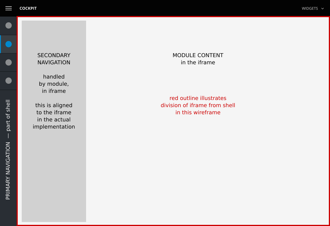
(As this wireframe serves as an illustration of the split between the shell and the module, the colors, fonts, spacing, and style are not to be taken literally.)
First, we'll look at how navigation would work on a desktop browser when the browser is full screen.
This has a drawback of taking up too much real estate from the actual content in the browser, so it should not be used by default when space does not allow. As such, top-level navigation elements should automatically be expanded when the screen is wide enough or when the menu toggle (via the top-left navigation menu) is activated.
Also noteworthy: Module labels in submenu navigation are turned off, as they're redundant with the top-level navigation.
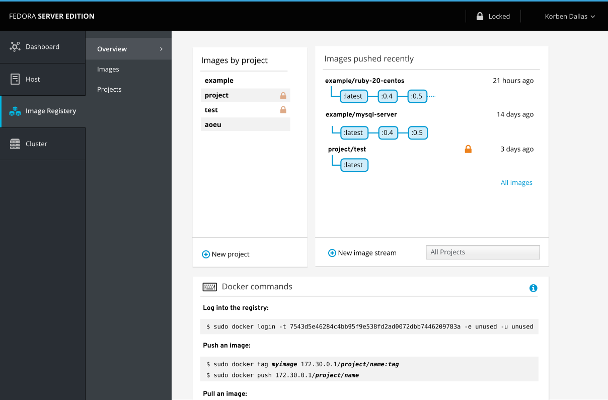
A more reasonable width for navigation would show up by default in all but high-resolution widths of desktop browsers. Top-level navigation would be collapsed by default, so that only icons are visible.

As "mystery-meat" navigation is a big no-no, we need to label these icons somehow.
Also, it's important to keep secondary navigation visible and static, as:
- It's the primary focus. People will often stay within one main module ("dashboard") and switch between sub-menu items.
- As it's generated by the module, it's not so easy to have it show up on hover. (And in our use, that's a bad idea anyway — see the above point).
There are several solutions taking the above into account:
- Tooltips (either browser-based or JS-based)
- Tooltips have the drawback of forcing someone to hover over each item and read each separately. It's not the best experience. There's typically a delay before each tooltip is shown as well.
- Vertical navigation
- Rotated text is odd (& difficult) to read
- Rotated text can take up a lot of screen real estate and would cause overflow issues
- Expand buttons to show labels and shift content
- Animation is needed to show what's happening
- There are several drawbacks:
- When moving away from the top-level navigation, targets change, causing misclicks
- Content is truncated
- Expand buttons to show labels and resize content
- Animation is needed
- Similar to the above solution, there are a few related drawbacks:
- Moving targets & misclicks (same as above)
- Content is resized, causing reflows (and a bunch of reflows when animated)
- Expand buttons above content, keeping second level and content as-is
- Animation is needed
- Content and navigation stays in place
After exploring all the above solutions, I've designed a solution that allows the top-level to collapse and expand on hover and keep everything else in place. It's based on solution #5.
First, the top-level navigation starts out collapsed.
When someone wants to switch to another module, they move their mouse to the left and when the sidebar is hovered, it expands on top of the content using CSS animation.
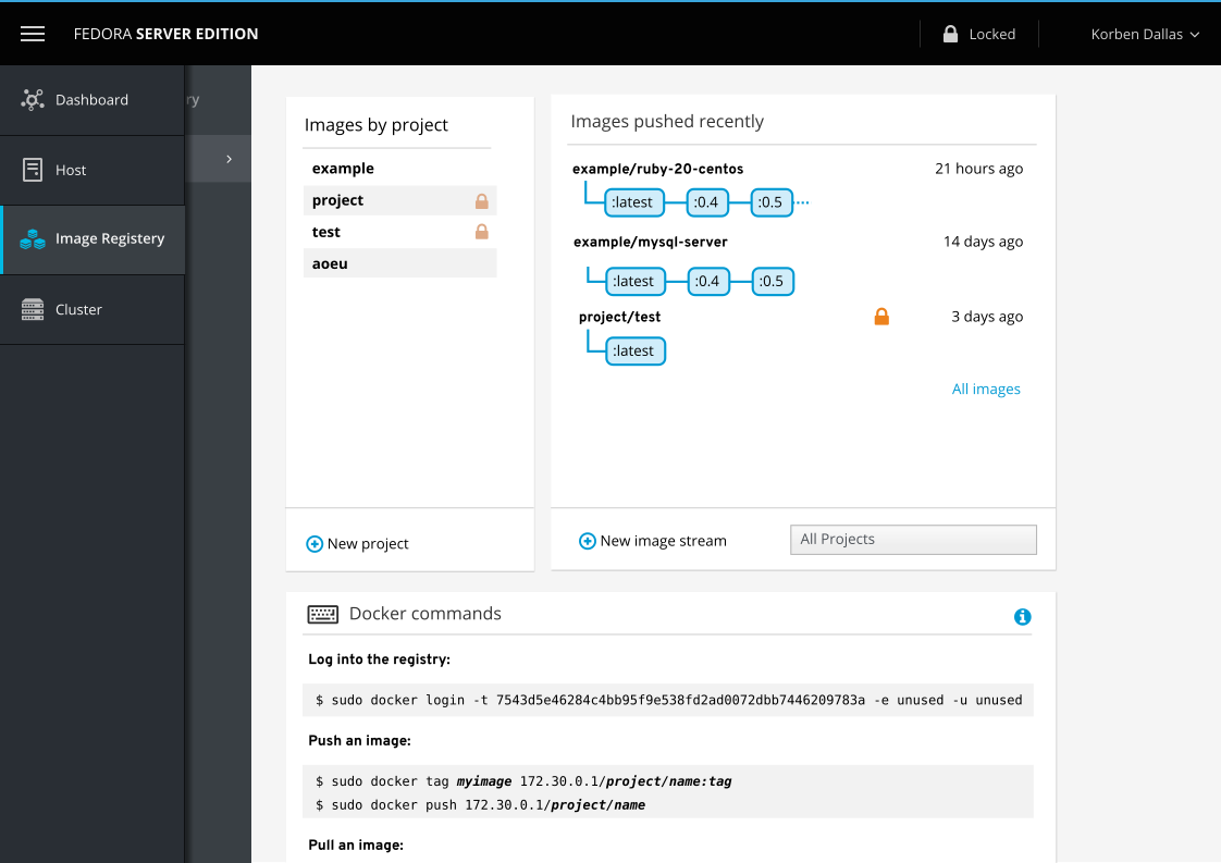
In addition to animation, to communicate what is happening, there is also a shadow from the menu that shows up on top of the content. This is composited over the module iframe, which includes the sub-navigation menu.
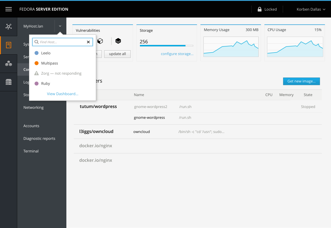
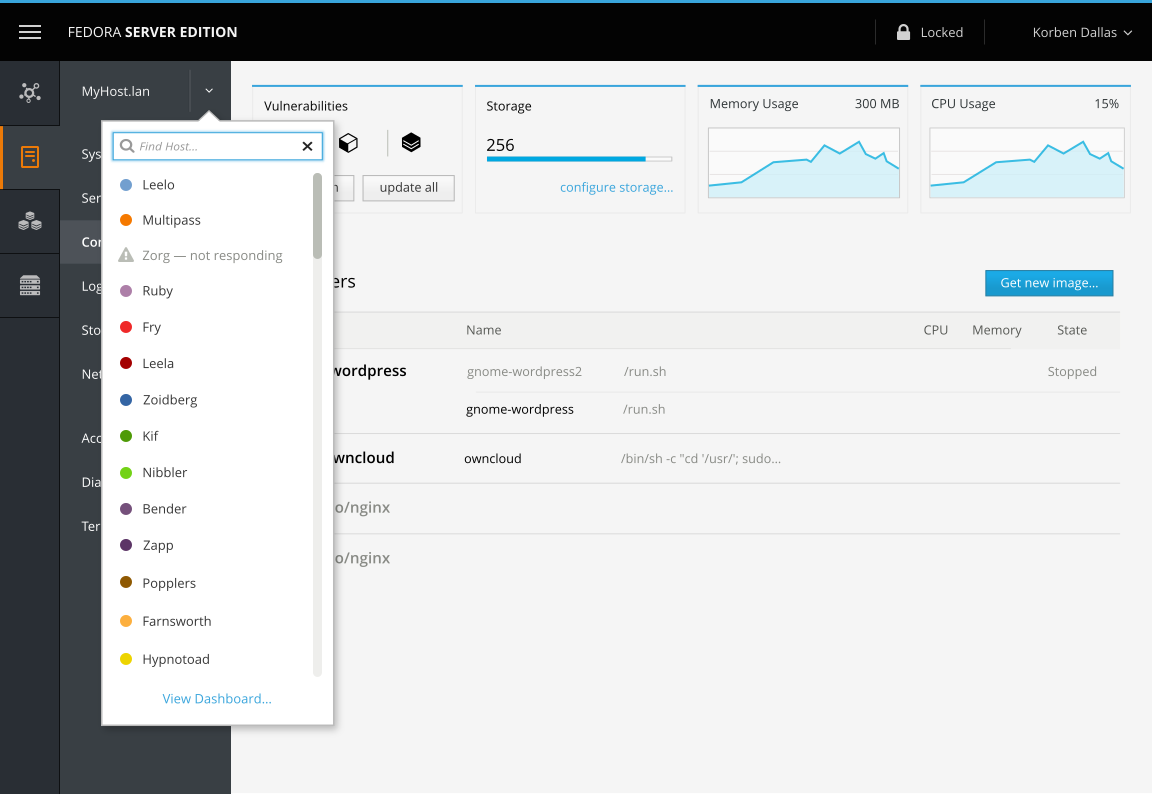
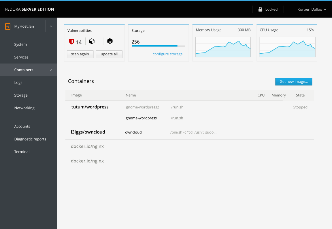
When a host is selected, the hostname and switcher now belong to the secondary navigation submenu. These take the place of the label of the module that's used in every other module.
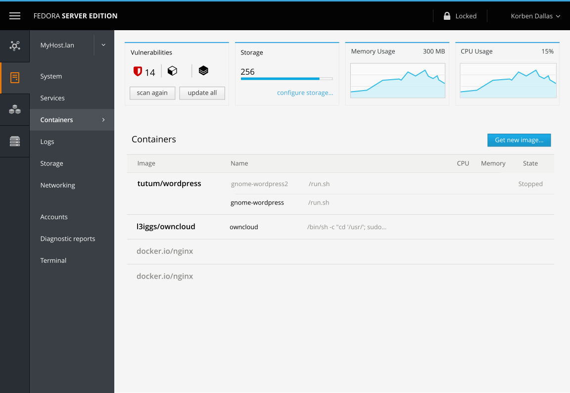
Unlike the other modules, the label does not disappear when the navigation is expanded (either due to manual expansion via the navigation icon in the top-left or if the browser is wide enough to automatically expand).
The switcher popup itself would look like the one in the host switcher design document.
In this design mockup, the host switcher is tied to the sub-navigation.
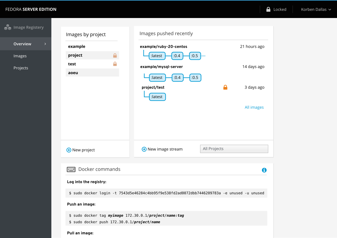
In standalone mode, no side navigation is shown. Instead, the sub-navigation is shown by itself and is changed by CSS. Currently, in this mockup, imagine a CSS class at the top of the sub-document that cascades down and allows the sidebar label, icon, and padding for each item (to allow them to align with the label) to show up.
The HTML would be the exact same as when the module is viewed in the shell with navigation.
Registry in standalone mode:
Host in standalone mode:
TBD
Mobile should not show the navigation by default. Tapping the menu icon in the top-left would make both halves of the navigation temporarily show — and this includes labels for top-level navigation.
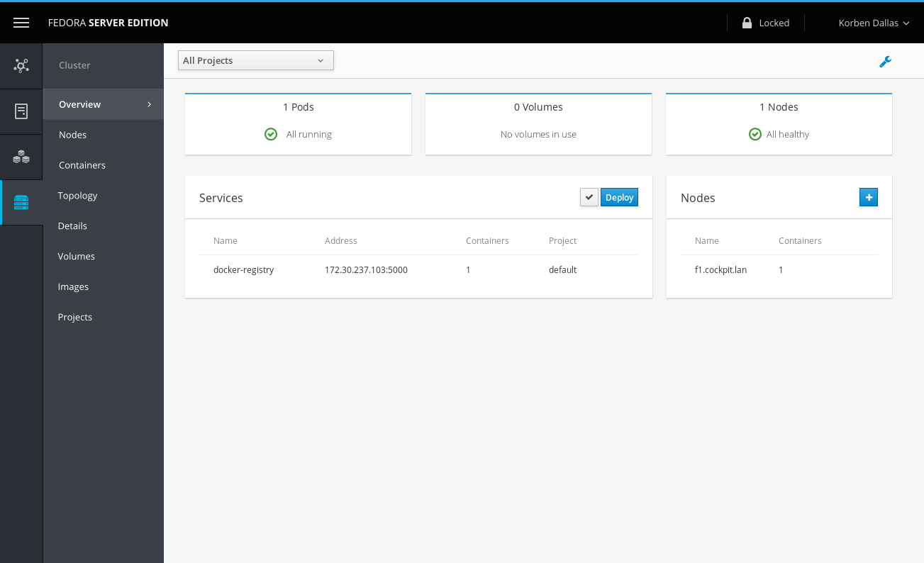
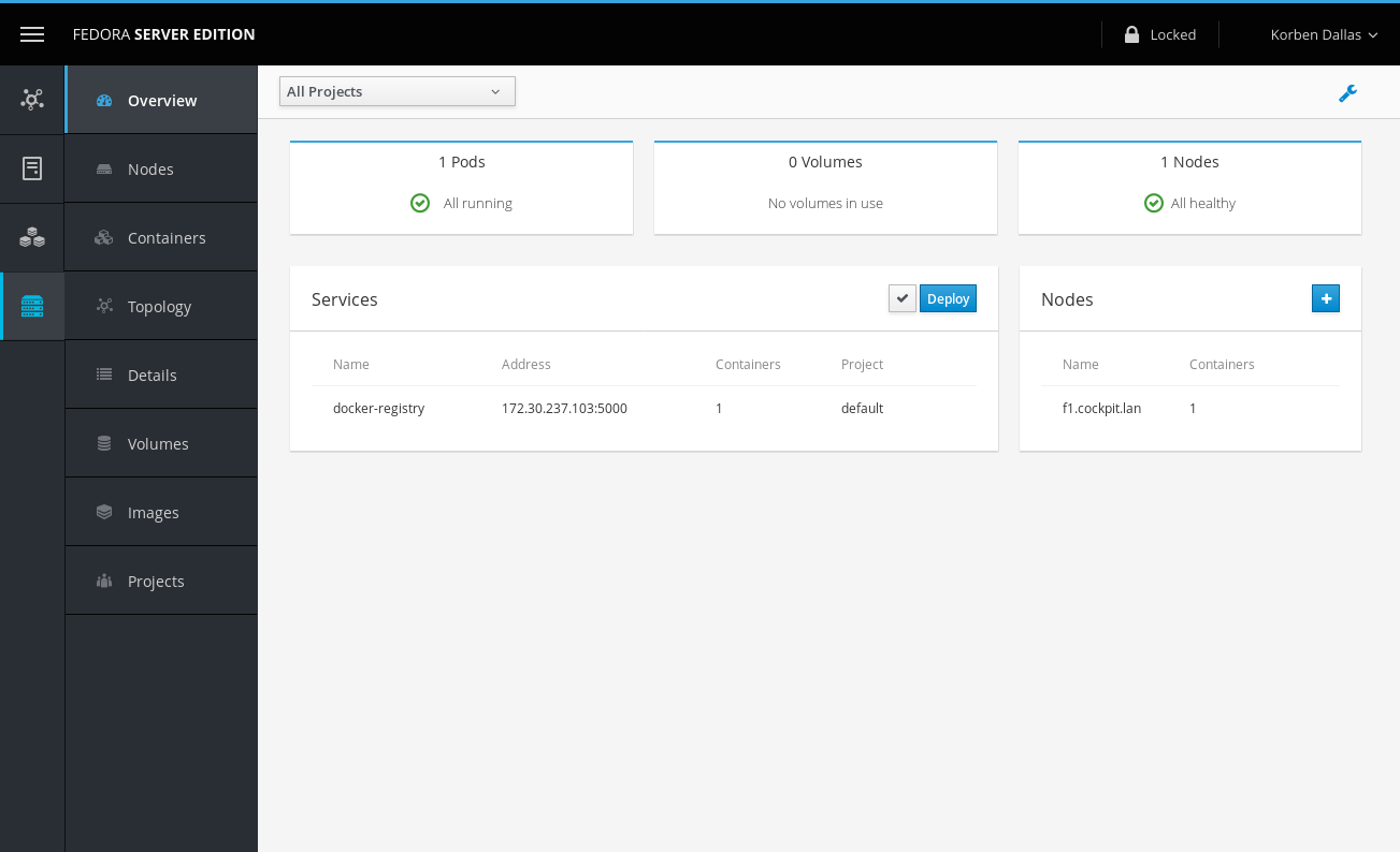
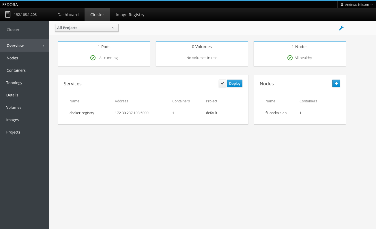
These mockups compare what the Cluster module's overview tab would look like inside of Cockpit, regardless if either are new or old.
| New shell, new module | New shell, old module | Old shell, new module |
|---|---|---|
 |
 |
 |
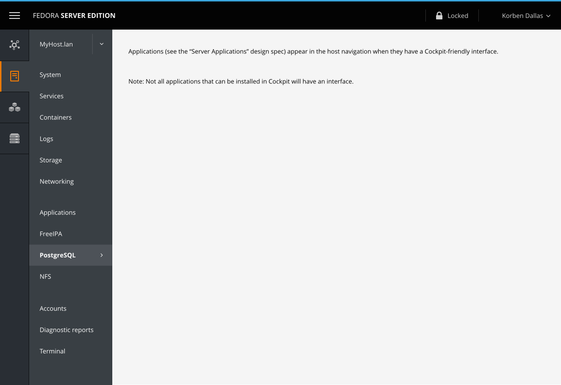
The upcoming Server Applications support will include some applications with Cockpit-specific UI that should appear in Cockpit's menu.
Not all Applications will have Cockpit support. Those without an interface will not show up in the navigation. (This specifically refers to headless services and text-base console apps.)
PR #5980 sets good guidelines on the order of the menu:
- System info
- Logs for troubleshooting
- Configuring major subsystems: Storage, Networking
- Stuff running on the system: Containers and Virtual Machines
- Implementation details: Admin accounts, Services/Units
- These tools are sorted alphabetically
Based on these guidelines, I placed the applications into the "Stuff running on the system" category and set them apart as a separate group. As the applications install/uninstall interface is associated with the applications, I list that first in the group.
For more details on this feature, please read the Server Applications design page.
I've made a prototype of the widget using HTML+CSS+JS. (The JavaScript is simple and very limited — mainly to toggle classes.) This HTML+CSS+JS is not intended to be used as reference for the final widgets.
View the navigation prototype.
Please note that this demo's purpose is to get the feeling of the widget. Styles and content may differ slightly from the mockups on this page. When in doubt, default to the text and images on this page, not the prototype.
TBD
- Current Cockpit-related screenshots
- Patternfly examples
- (Perhaps other things like Android sidebar nav)