Feature: Kubernetes: Basic Graphs
Basic graphs provided on the dashboard.
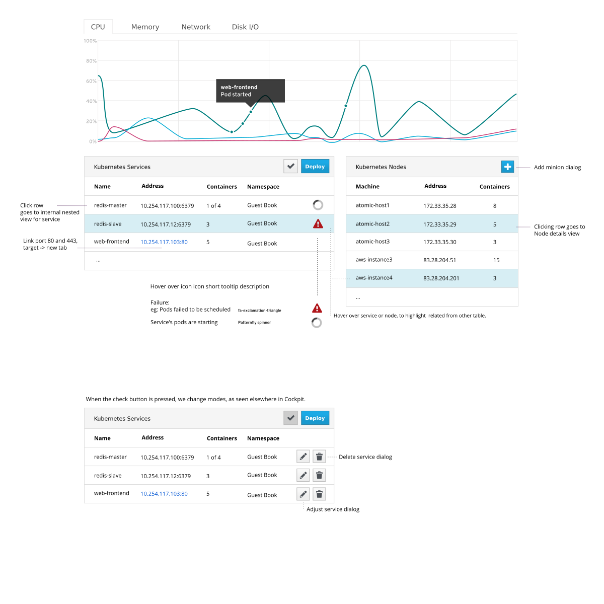
- This is at the top of the first page the user sees. The graphs are shown above the basic dashboard.
- Show basic load and simple events.
- Show what happened on the cluster.
- Graphs for: CPU, Disk IO, Memory Usage, Network Traffic
- Other graphs are currently out of scope
- Archiving and retrieving historical data is out of scope.
- Whatever cAdvisor gives us is what we have.
Phillip J. Fry leads a small IT at a moderately sized firm. His company has a modest data center.
Phillip is running the 'Poppler.io' application. 'Poppler.io' is an application that runs on top of a Kubernetes cluster. This morning the application stopped "working". Phillip uses the dashboard to diagnose the issue.
Hermes Conrad is the VP of engineering at a large corporation.
Hermes is exploring Kubernetes as a way to orchestrate containers. He has just setup a Kubernetes master, and add further machines. Hermes has no deep knowledge of Kubernetes, but Docker was seemed easy to discover hands-on, and wants to do the same here. Hermes uses the dashboard to see which services are running, where they are running, and start exploring the cluster.
Phillip:
- Opens the Kubernetes dashboard in Cockpit
- Sees list of Kubernetes services running on cluster
- He several services in the line graph of CPU usage
- Phillip highlights a line in the graph and sees the relevant service below highlighted.
- As dots along the line he sees various events.
- He highlights the events and sees that a docker container is cycling, restarting
Hermes:
- Opens the Kubernetes dashboard in Cockpit
- Deploys an application (separate feature)
- Using the network, memory and disk graphs he can see the pods starting up, and their activity
- cAdvisor API now runs in kubelet, on same port 4194
- Broken in Fedora: https://bugzilla.redhat.com/show_bug.cgi?id=1210364
- cAdvisor API documentation: https://github.com/google/cadvisor/blob/master/docs/api.md
- Tabbed line graphs similar to usual Cockpit dashboard
- Each line is a service, and shows the cumulative usage of that service's pods.
- In the case of a pod routed to by two services, the usage shows up in both services.
- Various lines are highlighted when the mouse hovers over them, and the relevant services below are highlighted at well.
- Kubernetes events (starting, stopping pods) are shown as dots along the lines, ready for hovering over to get more information.
- Trying to use D3 to graph the information
Please give feedback on the above! This is the place where those not working on the feature can provide insight, questions, limitations, notes etc.
- ... (sign name)
- ... (sign name)