Feature: Memory graphs
Display a consistent and immediately understandable visualization of memory usage, custom-tailored to how Linux manages memory.
- Display (accurate) total amount of memory
- Show actively used memory in a clear manner
- Consider buffers/caches as part of available / free-to-use memory
- Implement warning/error states, when system is actually out of usable RAM
- Show swap and how it relates to memory
As it's really important to understand what's going on with system RAM before reading the rest of the document, please read "Linux Ate My RAM" (which is a good not-too-techy explanation of how RAM on Linux works).
- Cockpit's memory usage graphs includes the cache but makes no distinction
- How much RAM do I have?
- machines: amount of RAM and how it's used is separate
- Container memory usage
- No CPU, Memory Graphs on Kubernetes
- Explicitly deal with containers without resource monitoring.
- Combined memory graph should turn red when the limit is approached.
- No obvious way to get back to System page from the CPU and Memory pages
- Switch from KiB/MiB to KB/MB in order to match CLI better?
Right now, Cockpit has multiple graphs of memory usage and:
- None of the memory graphs are consistent
- Memory graphs are wildly inaccurate, with regard to telling the story of how memory is being used
The host overview page has a memory graph, but it bundles everything together, making it look like the machine is out of memory:
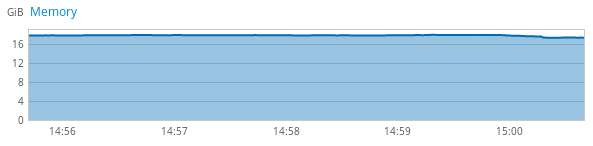
It should either have multiple colors here or only show (total - available) versus total (which is approximately used, but not exactly). Available is the actual value people care about; it would be the negative space in the graph.
According to this graph, all my RAM is full and I can't do anything on this computer anymore. The computer has 20 gigs of RAM (but only 16+ show up).
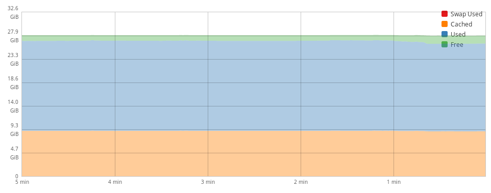
Example on the same computer, with values:
| total | used | free | shared | buff/cache | available | |
|---|---|---|---|---|---|---|
| Mem: | 19963184 | 6406912 | 2497116 | 1191004 | 11059156 | 12098144 |
| Mem (with -h): | 19G | 6.1G | 2.4G | 1.2G | 10G | 11G |
Notes: This is my work laptop with an integrated Intel video chip, which looks like it's stealing 1G RAM for itself. Also noteworthy: So much memory is being used for caching in browsers that do their own forms of caching on top of the system's own memory caching, thus inflating the used RAM and deflating the available a bit more than it otherwise would be. Browsers are basically their own operating systems, in a way.
The graph in Cockpit currently seems to show used + shared + buff/cache versus total. This results having the appearance of having only 1.7G free. However, if you look at available, there's clearly 11G that can easily be used. That's a huge difference!
Also, as total is 19G instead of 20, the graph only shows 16 and then some unspecified amount, which is... odd.
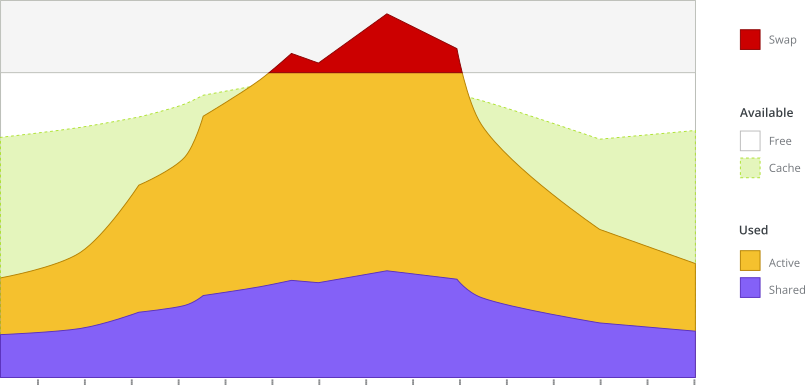
After clicking on the memory graph from the overview page, we see the following graph:
While there are more data points here, and someone could mostly get an idea about what's happening, there are a few problems here as well:
- It's not clear which part of the stacked graph is doing what, leading to false interpretations
- The data points are even out of order on how they're used —
cachedis highlighted and first, and it doesn't really matter - Out of all of these,
usedandswap usedare the only values that really matter (and for different reasons) - The graph goes to
32.6 GiB(oddly specific) out of19Gof system RAM (remember that 1G is used for the integrated video chip on this computer)
On the Dashboard page, multiple hosts may be shown. There's a line for memory — but what does it indicate? (It should show Available vs. Non-available (total - available).)
- Place an emphasis on unavailable (
total-available) memory versusavailable - Split out swap on its own (at least on the detailed page)
- Possibly also split out the standard Linux values of
used,free,shared,buff/cache— but as these don't add up to 100% of the total, graphing them all together is problematic - Show more information on the detailed page than just 1 chart
Sketch that shows 2 synchronized area graphs in an "iceberg" layout:
- Swap (if applicable)
- Memory (stacked area graph)
- available
- "free" (available - cache)
- cache (aka "buff/cache")
- used
- "active" (total - available - shared)
- shared
- available
The colors in the chart have been selected from the PatternFly palette to indicate their function, to work together nicely for those who can see color, and to be clear with adequate contrast in all the forms of color blindness.
[TBD: List color palette here]
The design for the memory graph on the host overview page should be constructed similarly to the memory details graph — except it should be simplified to show swap, available (calculated free and cache), and non-available (calculated used and shared).
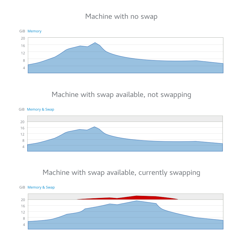
Machine with no swap:
- The maximum physical memory is shown as the top number
- The chart shows unavailable (total - available) in blue and available as empty space.
- Cache is considered part of the available (empty area) space.
- Shared is considered part of the used/unavailable space.
Machine with swap available, not swapping:
- Swap area (no matter the actual size) is reduced to 1/6
- Memory takes up the rest of 5/6
Machine with swap available, currently swapping:
- When a machine swaps, it indicates performance issues; swap is red as a warning
Memory in the dashboard is a combination of multiple machines, so it needs to be deconstructed even more.
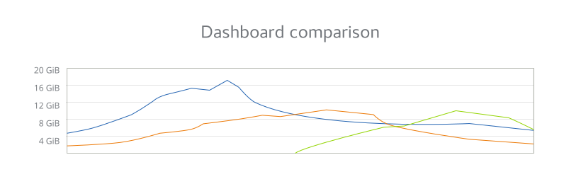
Each machine gets a color and they're shown together. This is pretty similar to what's already in Cockpit.
Noteworthy changes (which are not really obvious in the mockup):
- The maximum physical memory of the largest machine is shown as the topmost number on the y-axis.
- The chart simply shows unavailable (total - available) in the machine color.
- Cache is considered part of the available (empty area) space.
- Shared is considered part of the used/unavailable space.
This is pretty similar to the overview version of the graph. The main takeaway: Memory is calculated differently (graphing available vs. unavailable (total - available)).
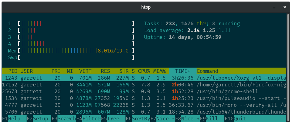
- htop shows memory in a simple bar graph
- memory appears to be
used+buffers/cache, which is somewhat close to (total-availablevstotal) but slightly misleading - swap, when enabled, is another percentage graph
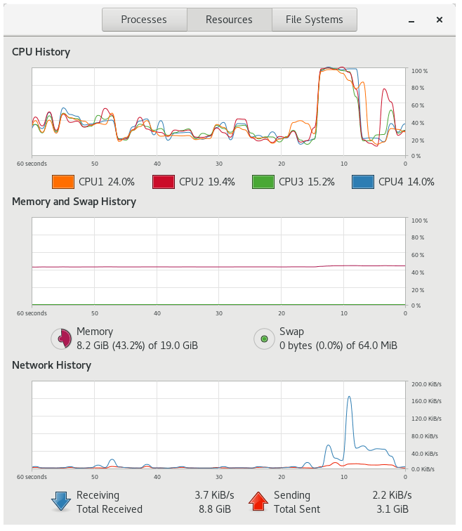
- memory is a single line expressed in percentages; it appears to also use
used+buffers/cache - memory also has a pie chart with detailed numbers to express the current used memory
- swap is a secondary color in the line graph, also focused on percentage utilization
- swap is another pie chart with details for current swap size