Responsive Grid for Views

Do you have a view with content you would like to display in a responsive grid? This tutorial will show you how you can leverage suitcase_interim's built-in functionality to create your own grid view.
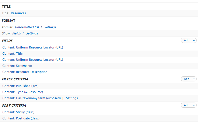
First, set up your view. Be sure to use the fields view styling setting when setting everything up:
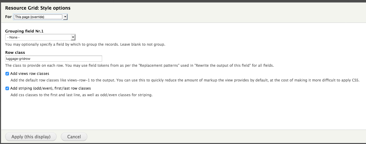
After you have a view with all of your desired fields ready, it's time to add classes to our views fields. Click on the settings link under your view's format settings option set. In this dialog box, enter "luggage-gridrow" in the row class text box. Also, be sure to have the striping and views row classes boxes checked You should see something like this:
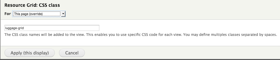
Save your settings. Next, we want to add a class to the whole view. Under your view's advanced settings, click on the CSS class setting. Add "luggage-grid" as a class here, like this:
Save this setting, and then save your view. Go to your view page and double-check that your view is, in fact, styled like a grid now.
Next, we'll explore other styling options available for your suitcase_interim grid.
Green field text -- Unsupported in suitcase_interim 1.0.6
If you'd like a field with some contrast to the rest of the theme, suitcase_interim has styling for green text in views. To make your view field green, you need to add a class to the field.
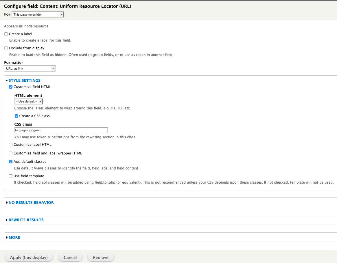
In the views UI for your view, go to the settings for the field you'd like to color green. Click on the collapsed style settings option set. You should see a series of options about field styling. Check the box for customizing the field HTML. More options should appear. Within these options, check the box labeled with "Create a CSS Class." Here, enter "luggage-gridgreen" for the field class. You should see something like this:
You can see this in action on the luggage_people view's position field and the luggage_resources view's URLs.
The responsive grid supports 2, 3, and 4 columns. 2 columns is the default. To use 3 or 4 columns, simply change your views row class name from luggage_gridrow to luggage_gridrow3 or luggage_gridrow4.

Here's how luggage_gridrow3 will look:

And here's how luggage_gridrow4 will look:
