
In any industry, understanding and improving product quality are of utmost importance. Not only does it enhance customer trust, but it also reduces production costs, contributing to overall profitability. This project aims to explore product quality rejection data in detail and analyze the reasons for product rejections. By taking proactive actions based on these insights, we can effectively enhance the overall manufacturing process.
The products that I am analyzing in this project is called Instrument Protectors (the link of the products has been mentioned below). The data is gathered by a computer vision system which captures the image of a product, processes it, identifies a defect and logs the region of the defect's coordinates (x,y regions). The idea is to thoroughly examine these defect logs, identify critical regions, and present the findings in a clear and actionable manner to highlight potential issues in the product.
Product Link:
To achieve the goal, I initially examined the defect logs data and visualized the defect coordinates. Subsequently, I attempted to create a plot to highlight the critical defect regions. However, as I delved deeper into the analysis, I quickly realized that the task was not as straightforward as anticipated.
In this project we are analyzing two similar products but of different dimensions. Thus the defect coordinates are going to vary based on the product size. Although we are unknown about the original dimensions of the product but by analyzing the below two plots (Fig. 1) we can clearly have an idea how to segregate the two products based on their defect regions. It also very difficult to say at this moment which are the most critical area of issue for the product as the defect is occuring throughout.
For the smaller product, a rectangular region is clearly visible whereas for the medium sized product a rectangular white line can be identified in between by a close look. It is important to notice that any time a defect coordinate is getting logged out of this rectangular regions are happening becuase of misaalignment. Therefore it also will be important to note the number of products being rejected due to misallignment. From the below plot though, it is very clear that medium sized products are having a lot more misallignment than the small products.
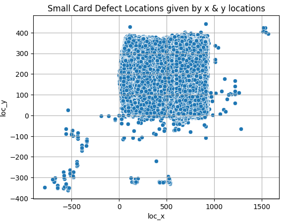
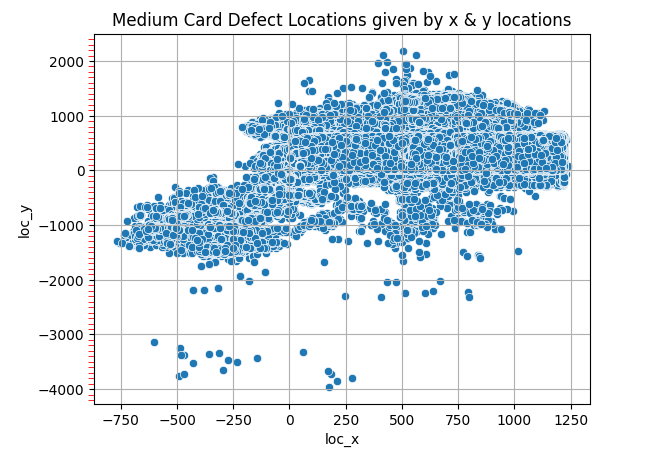
Fig. 1
As the defects was occuring throughout the product and there was no clear way to understand the critical region therefore, It was thus planned, to divide the whole product in 9 different regions. And then simply count the defects occuring on those regions to highlight the critical region. To achive that, the dimensions of the products need to be more clearly defined which was possible witht the defect coordinates. With the help of the below histograms (Fig. 2, only shown for the medium sized cards) with combination of the above scatter plots, it was possible to identify the overall x and y coordinates of the different products (calculations are detailed inside the notebook).
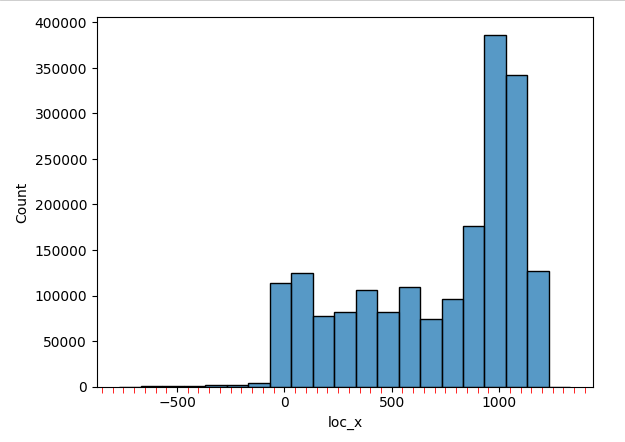
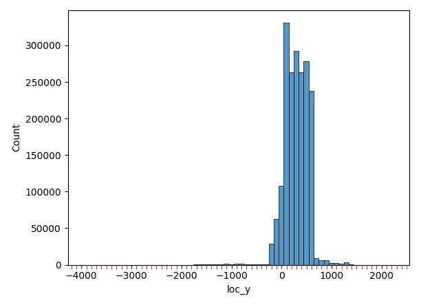
Fig. 2
Link to Notebook: Define_Product_Dimensions.ipynb
With above understanding of the product dimensions as caught by the computer vision system, it was now only a matter of calculating the number of defects in each 9 divided region. To present the critical regions more effectively, a heatmap was developed using Plotly, which was overlaid on top of the product image. The resulting two plots clearly highlight that the majority of defects are occurring in the rightmost central region for both products. In the smaller product, the next most critical region can be observed on the bottom right-most region whereas for the medium product it is on the top right-most region. It was also possible to calculate the misaalignment issues due to which products were getting rejected and calculations are detailed inside the notebook.
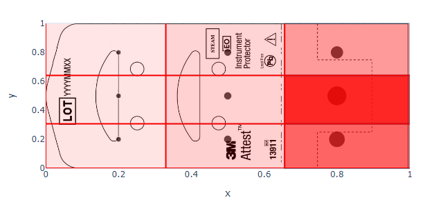
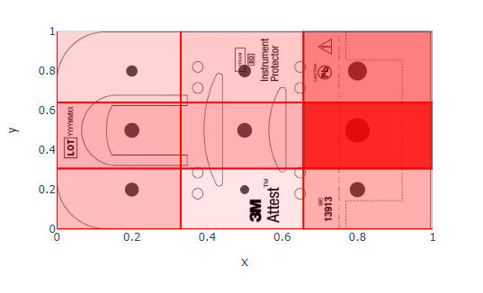
Fig. 3 (Left: Small Prodcut, Right: Medium Product)
Link to Notebook with plotly graphs: Defect_Location_Visualization.ipynb
This analysis can provide valuable insights to product manufacturers, informing them about the most vulnerable regions of their products to defects. Armed with this information, they can create more informed design plans aimed at reducing the occurrences of such issues. Moreover, with an increase in data, it becomes possible to track spatial changes in defect regions over time, verifying the product's improvement and ultimately leading to a reduction in operational costs.