A dark UI theme based on Apex' gorgeous white apex-ui theme, ported to a fork of Atom's One Dark for the added ability adapt to most syntax themes.
If you haven't already, go see the original theme by Apex here!
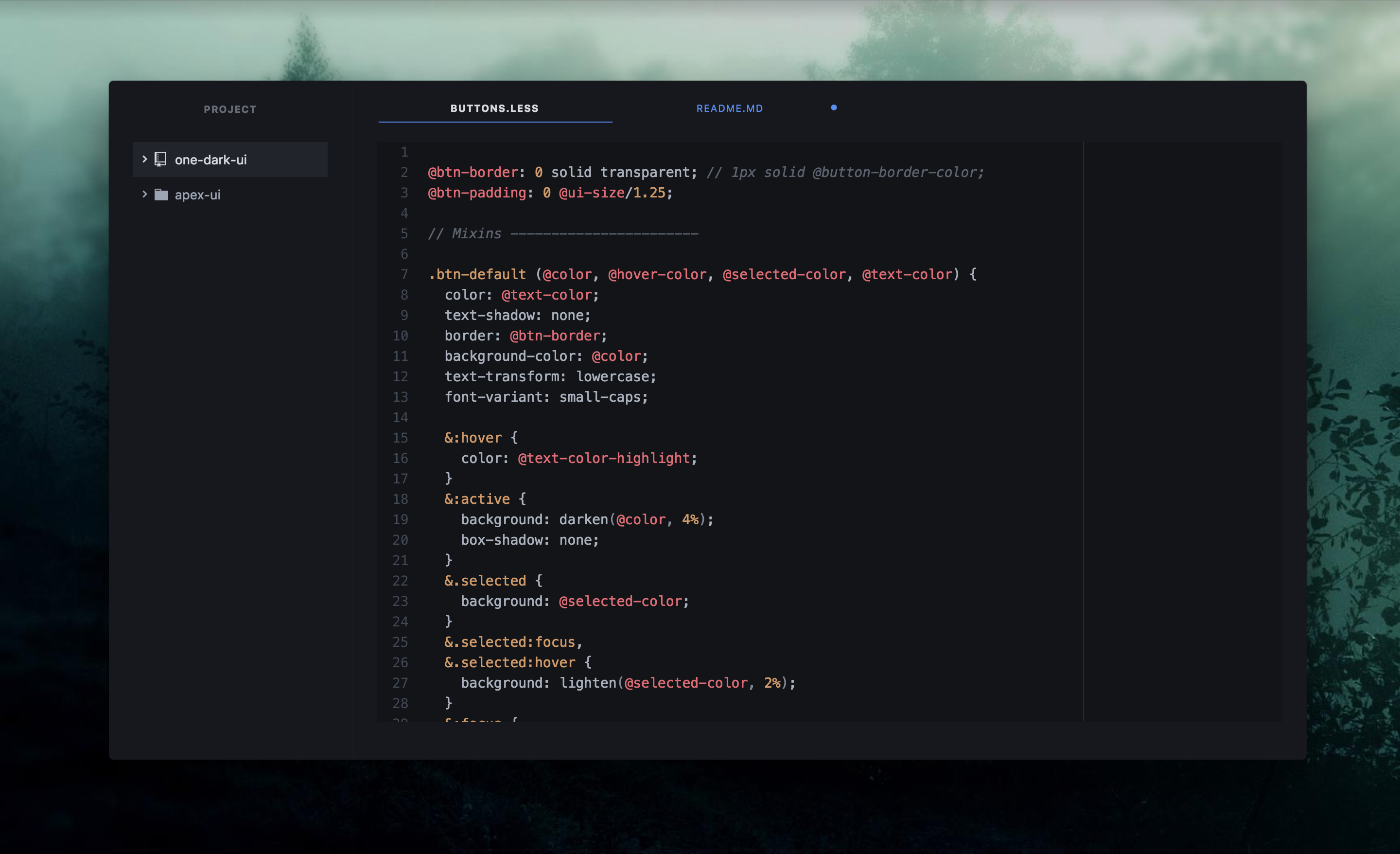
The font used in the screenshot is Hack.
Install this theme using Settings > Install. Select the "Themes" toggle and search for "apex-adapt-dark-ui". From there, go to Settings > Themes section and selecting "Apex Adapt Dark" from the UI Themes drop-down menu.
For the atom package page, visit: https://atom.io/themes/apex-adapt-dark-ui
In the theme settings you can:
- Change the Font Size to scale the whole UI up or down.
- Choose between 3 Tab Sizing modes.
- Hide the dock buttons.
To make changes, go to Settings > Themes > Apex Adapt Dark UI > Settings or the cog icon next to the theme picker.
It's also possible to resize only certain areas by adding the following to your styles.less (Use DevTools to find the right selectors):
.theme-apex-adapt-dark-ui {
  .tab-bar { font-size: 18px; }
  .tree-view { font-size: 14px; }
  .status-bar { font-size: 12px; }
}Why do the colors change when I switch Syntax themes? This UI theme uses the same background color as the chosen syntax theme. If that syntax theme has a light background color, it only uses its hue, but otherwise stays dark. This lets you use dark-light combos.