A custom Android button

English | 简体中文
I won't add any new features further.
Note:I recommend that you use VastTools, which provides ShapeAndStateUtils that can meet most of your needs.
allprojects {
  repositories {
    ...
    maven { url 'https://jitpack.io' }
  }
} dependencies {
implementation 'com.github.SakurajimaMaii:ShapeButton:0.0.5'
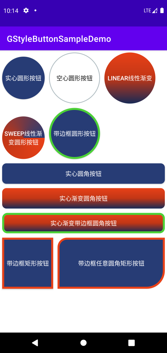
}- Circular/Oval Button
- Rectangle Button
- Rounded Rectangle Button
- Any rounded rectangle button
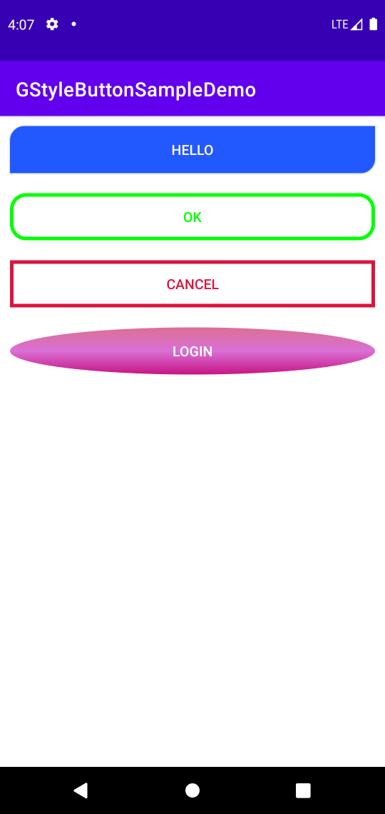
- Default (normal)
- Click or touch (pressed)
- Focused (focused)
- Unable(unable)
<com.gcode.widget.ShapeButton
    android:id="@+id/button"
    android:layout_margin="10dp"
    android:layout_width="wrap_content"
android:layout_height="wrap_content" />Here is a Kotlin way.
button4.apply {
  setButtonShapeType(ShapeButtonShapeType.ANY_ROUNDED_RECT_SHAPE)
  setAnyRoundedRectCornerRadius(10f,0f,20f,0f)
  setIsSolid(true)
  setIsSolidColorGradient(true)
  setGradientDirectionType(ShapeButtonGradientType.LINEAR_GRADIENT)
  setSolidColorGradient(
      ContextCompat.getColor(context, R.color.red),
      ContextCompat.getColor(context, R.color.design_default_color_primary_dark),
      ContextCompat.getColor(context, R.color.design_default_color_primary_variant)
  )
  setStrokeWidth(10f)
  setRectButtonWidth(500f)
  setRectButtonHeight(300f)
  setBgColorStateList(
      ContextCompat.getColor(context, R.color.palevioletred),
      ContextCompat.getColor(context, R.color.blue),
      ContextCompat.getColor(context, R.color.mediumvioletred),
      ContextCompat.getColor(context, R.color.red),
  )
  setStrokeColorStateList(
      ContextCompat.getColor(context, R.color.yellow),
      ContextCompat.getColor(context, R.color.greenyellow),
      ContextCompat.getColor(context, R.color.orange),
      ContextCompat.getColor(context, R.color.darkgrey),
  )
  create()
}
Finally, you must call the create() method, otherwise it will not take effect.
| Attribute name | Type | Description | Default value |
|---|---|---|---|
| button_shape | dimension | Button shape | oval_shape rect_shape rounded_rect_shape any_rounded_rect_shape |
| button_rect_width | dimension | Rectangular button width | |
| button_rect_height | dimension | Rectangular button height | |
| button_oval_radius | dimension | Oval button radius | |
| button_rounded_rect_corner_radius | dimension | Rounded radius of rounded rectangular button | |
| button_left_top_corner_radius | dimension | LT corner radii of any rounded rectangular button | |
| button_left_bottom_corner_radius | dimension | LB corner radii of any rounded rectangular button | |
| button_right_top_corner_radius | dimension | RT corner radii of any rounded rectangular button | |
| button_right_bottom_corner_radius | dimension | RB corner radii of any rounded rectangular button | |
| button_is_solid | boolean | true is button solid,false otherwise |
true false |
| button_is_solid_color_gradient | boolean | true is solid color gradient,false otherwise |
true false |
| button_start_solid_color | color | Start solid color | |
| button_center_solid_color | color | Center solid color | |
| button_end_solid_color | color | End solid color | |
| button_gradient_type | dimension | Gradient type | linear_gradient radial_gradient sweep_shape |
| button_gradient_orientation | dimension | Gradient orientation | |
| button_gradient_radius | dimension | Gradient radius | |
| button_stroke_width | dimension | Stroke width | |
| button_normal_bg_color | color | Default button background color | |
| button_pressed_bg_color | color | Button background color when button is pressed. | |
| button_focused_bg_color | color | Button background color when button is focused. | |
| button_unable_bg_color | color | Button background color when button is unable. | |
| button_normal_stroke_color | color | Default button stroke color. | |
| button_pressed_stroke_color | color | Button stroke color when button is pressed. | |
| button_focused_stroke_color | color | Button stroke color when button is focused. | |
| button_unable_stroke_color | color | Button stroke color when button is unable. |