ColourBlind is a collection of colour-blind-friendly colour tables for sequential, diverging, and qualitative data, provided for use with the Interactive Data Language (IDL). RGB values can additionally be found within the code descriptions below.
This repository was inspired after many people approached me to judge the colour blind friendliness of their plots (and in some part, by this tweet). The final aim of this repository is to collate colours tables from many sources (see "code descriptions and their origins"), and provide them in an easy-to-use format. For those looking for nice examples, this article on picking a colour scale for scientific graphics is a great start, and a number of the colorbrewer tables can be found within IDL. Additionally this GitHub repository allows the user to import matplotlib (http://bids.github.io/colormap/) colour tables into IDL.
If you wish to acknowledge use of this repository, I recommend text such as the following:
-
Some/all of the figures within this paper were produced using IDL colour-blind-friendly colour tables \citep[see][]{pjwright}.
-
This research made use of IDL colour-blind-friendly colour tables \citep[see][]{2017zndo....840393W}.
where the BibTeX entry is as follows (taken from https://ui.adsabs.harvard.edu/abs/2017zndo....840393W):
@MISC{2017zndo....840393W,
author = {{Wright}, Paul},
title = "{ColourBlind: A Collection of Colour-blind-friendly Colour Tables}",
year = 2017,
month = aug,
eid = {10.5281/zenodo.840393},
doi = {10.5281/zenodo.840393},
publisher = {Zenodo},
adsurl = {https://ui.adsabs.harvard.edu/abs/2017zndo....840393W},
adsnote = {Provided by the SAO/NASA Astrophysics Data System}
}
In this example, the DOI is not specific to a particular version:
- Wright, P. J.; Hannah, I. G.; Grefenstette, B. W., et al. 2017, ApJ, 844, 132 [Open Access]
- Marsh, A. J.; Smith, D. M.; Glesener, L., et al. 2017, ApJ, 849, 131
- Reep, J. W.; Russell, A. J. B.; Tarr, L. A.; Leake, J. E, 2018 ApJ, 853, 101
- Reep, J. W.; Polito, V.; Warren, H. P.; Crump, N. A., 2018, ApJ, 856, 149
- Rempel, M., 2020, arXiv:2004.01795
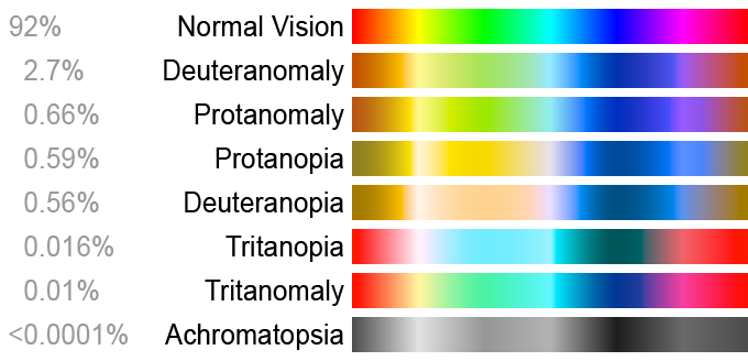
Colour blindness is really a misnomer. Those who are colour blind are generally colour vision deficient, which is the inability to distinguish certain colours rather than not being able to see them at all.
One method for detecting someone's ability to perceive colour, is the Ishihara test:
Two example Ishihara colour test plates (Source: Wikipedia)
(Left) Demonstration plate designed to be visible by all persons, whether normal or colour vision deficient. (Right) The number "74" should be clearly visible to viewers with normal colour vision. Viewers with dichromacy or anomalous trichromacy may read it as "21", and viewers with monochromacy may see nothing.
[2nd May 2020]
I would highly recomemnd against this colour table as it notoriously bad (for folk with colour blindness) but is widely used for data that is diverging (the data straddle 0, or show a departure from a reference value).
loadct,4.
colorblind.pro
A set of 7 (+ black and white) colour blind friendly colours based on the notes of Paul Tol (https://personal.sron.nl/~pault/):
"For 5 or more colours, I use them in clockwise order from bottom left (https://personal.sron.nl/~pault/images/betterdistinct.png): blue, cyan, green, yellow, red, pink, grey (and black). For 4 or fewer colours, I switch cyan and red: blue, red, green, yellow. But I deviate when plot lines have a logical colour association, e.g. cloud fraction above oceans blue and above desert yellow."
.compile colorblind.pro
colorblind, n_colors=7, /ploteps
; the code loads in a 7 colour colour table and outputs an
; EPS indicating the color indexes for the range of n_colors (SolarSoftWare required)
xpalette ;xpalette will display the colour table
; plot as normal, i.e.:
plot,x,y,color=0 ;color = 0 through 8
where the RGB values are:
R = [68,102,34,204,238,170,187]
G = [119,204,136,187,102,51,187]
B = [170,238,51,68,119,119,187]
colorblind2.pro
A set of 7 (+ black and white) colour blind friendly colours. These colours are more vibrant than colorblind.pro. Inspired in some part by Wong, B. Nat. Methods 8, 441 (2011).
.compile colorblind2.pro
colorblind2, n_colors=7, /ploteps
; the code loads in a 7 colour colour table and outputs an
; EPS indicating the color indexes for the range of n_colors (SolarSoftWare required)
xpalette ;xpalette will display the colour table
; plot as normal, i.e.:
plot,x,y,color=0 ;color = 0 through 8
where the RGB values are:
R = [0,86,0,240,230,213,187]
G = [114,180,158,228,159,94,187]
B = [178,233,115,66,0,0,187]
npr_colors.pro
A set of 6 (+ black and white) colour blind friendly colours based on those used by NPR (Credit: Katie Park, Alyson Hurt, Tyler Fisher and Lisa Charlotte Rost/NPR) .
.compile npr_colors.pro
npr_colors
; the code loads in all colours
xpalette ;xpalette will display the colour table
; plot as normal, i.e.:
plot,x,y,color=0 ;color = 0 through 8
where the RGB values are:
R = [224,240,231,82,0,237]
G = [70,159,223,192,98,237]
B = [6,82,190,173,100,237] - Paul Tol's Personal Website: An excellent selection of existing IDL routines for discrete and continuous colour tables: distinct_colors.pro; sunset_colors.pro; burd_colors.pro; rainbow_colors.pro
- Picking a colour scale for scientific graphics
- Wong, B. Nat. Methods 8, 441 (2011): A short piece on colour blindness in Nature Methods.
- http://blog.usabilla.com/how-to-design-for-color-blindness/
- http://mkweb.bcgsc.ca/colorblind/
- http://jfly.iam.u-tokyo.ac.jp/color/
- https://knightlab.northwestern.edu/2016/07/18/three-tools-to-help-you-make-colorblind-friendly-graphics/
- Color Oracle is a free colour blindness simulator for Linux/Mac/Windows. In their own words: "it takes the guesswork out of designing for colour blindness by showing you in real time what people with common colour vision impairments will see."
- coolors.co is a free colour scheme generator.
- Gregor Aisch’s chroma tool is useful for optimizing your diverging colour palettes. It can help you take two or more colors and generate a full scale of in-between values.
- ColorBrewer has a range of palettes that are colorblind safe.
- Multi-hued Color Scales A blog post on multi-hued colour scales.
- COLOURLovers Pre-made colour palettes, and trends.


