[ENH]: Automatically trim the time on the x axis #28158
Comments
|
As a first pass, this could probably be implemented using funcformatter or zoom events & might make a good example of dynamic label updating on zoom? https://matplotlib.org/3.8.4/gallery/ticks/custom_ticker1.html#sphx-glr-gallery-ticks-custom-ticker1-py Basically wondering on trade offs if a good example of how to do this would be more useful than a library function that may need a bunch of parameters to get folks what they want. |
|
I wonder if the offset label could also help? Like, if all of the tick
labels have the same date portion, then stick that in the "offset" label,
and put the times in the tick labels, like how we'd do for tick labels of
very large numbers.
…On Wed, May 1, 2024 at 2:12 PM hannah ***@***.***> wrote:
As a first pass, this could probably be implemented using funcformatter &
might make a good example of dynamic label updating on zoom?
https://matplotlib.org/3.8.4/gallery/ticks/custom_ticker1.html#sphx-glr-gallery-ticks-custom-ticker1-py
Basically wondering on trade offs if a good example of how to do this
would be more useful than a library function that may need a bunch of
parameters to get folks what they want.
—
Reply to this email directly, view it on GitHub
<#28158 (comment)>,
or unsubscribe
<https://github.com/notifications/unsubscribe-auth/AACHF6HXHNFJA6HAPJ7ULH3ZAEV7ZAVCNFSM6AAAAABHCAXTAWVHI2DSMVQWIX3LMV43OSLTON2WKQ3PNVWWK3TUHMZDAOBYHA3DMMBTGU>
.
You are receiving this because you are subscribed to this thread.Message
ID: ***@***.***>
|
|
@WeatherGod That’s basically what ConciseDateFormatter is doing https://matplotlib.org/stable/gallery/ticks/date_concise_formatter.html. |
|
The problem with the ConsiseDateFormatter, is that it will indicate a date on top of the time. For timestamps, I don't really want Jan 1, 1970 to be there. To elaborate on the issue, there are actually two issues in one: make sure that the ticks labels don't appear on top of each other, and reduce the ticks labels to their most significant digit. |
|
AFAIK this is not possible. And it would be tricky: Formatters need to know all label positions and from that determine the number of significant digits. If Locators on the other hand, want to decide placement on the label size, this would result in a mutual dependence loop. |
|
Is this time formatter from librosa kinda what you're after: https://librosa.org/doc/main/generated/librosa.display.TimeFormatter.html |
|
I am confused by the example. Standard python datetimes have microseconds so I tried this: import datetime
import matplotlib.pyplot as plt
x = datetime.datetime(2021, 5, 4)
dates = [x.replace(minute=n, microsecond=n) for n in range(50)]
ax = plt.figure().add_subplot()
ax.plot(dates, range(50))
If I use the date formatter as in the OP (less than 1 hour case) I only get years: import matplotlib.dates as mdates
formatter = mdates.AutoDateFormatter(mdates.AutoDateLocator(), defaultfmt='%M:%S')
ax.xaxis.set_major_formatter(formatter)
If instead I define the formatter using the locator instance on the axis, it goes back to what you get by default: formatter = mdates.AutoDateFormatter(ax.xaxis.get_major_locator(), defaultfmt='%M:%S')
ax.xaxis.set_major_formatter(formatter)
What am I missing? I admit I have not really followed what the defaultfmt keyword does. I am using mpl 3.8.2. |


|
@story645 Rotating the ticks is not always an option, unfortunately. I would need this for two different projects, and in one of these I am plotting 8 subplots (2 horizontally, 4 vertically) in the same graph, so I need the x axis to be as compact as possible. I will look into your librosa function, though, thanks for that! @rcomer To be fair I am also confused between formatters and locators, and the code I have provided is mostly the result of tinkering around with diverse solutions I found online. In any case, I did obtained the different results you are showing in your figures at various points, but none of them give interesting results... So I am a bit lost. In any case, thanks to all of you for the interest on this question. After looking around and asking the question on other forums, I seem to understand that it is a feature that other people would be interested in! |
|
Would you consider making a self contained example that makes the problem clear? We can't reproduce your issue if we can't run your code. |
Can you elaborate on this a bit so that we can try and make the documentation clearer? Broadly:
These generally function independently, but sequentially - so locator generates positions then formatter labels those positions. That's why Tim and I don't think a locator that adjusts tick positions based on the formatter generated label would be feasible, though I'm now curious about the Librosa implementation. |
|
Also @ksunden dynamic relabeling/scale adjustment based on subsample resolution of unitized data (which thinking more, Librosa knows it has dates) might be a good example for the data-prototype (if you don't already have one 😅). |
|
I think I have understood now. It is not about the precision of the data, but if the interval between the ticks is less than a second: import datetime
import matplotlib.pyplot as plt
x = datetime.datetime(2021, 5, 4)
dates = [x.replace(second=n) for n in range(3)]
ax = plt.figure().add_subplot()
ax.plot(dates, range(3))
The behaviour is defined by the rcParam |

|
And actually the AutoDateFormatter docstring tells us we can modify that with a function: import datetime
import matplotlib.pyplot as plt
import matplotlib.dates as mdates
x = datetime.datetime(2021, 5, 4)
dates = [x.replace(second=n) for n in range(3)]
ax = plt.figure().add_subplot()
ax.plot(dates, range(3))
def my_format_function(x, pos=None):
x = mdates.num2date(x)
fmt = '%M:%S.%f'
label = x.strftime(fmt)
label = label.rstrip("0")
label = label.rstrip(".")
return label
formatter = mdates.AutoDateFormatter(ax.xaxis.get_major_locator())
formatter.scaled[1 / mdates.MUSECONDS_PER_DAY] = my_format_function
ax.xaxis.set_major_formatter(formatter)
|

|
Hi! Thank you for all of your responses. I realize now that my question wasn't clear at the beginning, so I will provide a full and simplified description of my problem, as suggested by @jklymak Clear description of the issues
First example: no formatting, numpy datetime64[us]This is the minimal reproducible example for my use case. I am importing a WAV file, creating timestamps from its frequency, and plotting it, passing the timestamps on the x-axis. CodeOutput
RemarksAs you can see, when plotted, the timestamps are on top of each other - plus, here, we do not really care about the precision after the 3rd decimal place as the ticks are spaced by 2 ms each. Ideally, the significant digits would increase when I zoom in dynamically using the mouse; however, the precision remains at 6 digits after the decimal point, no matter what. Note that the output is exactly the same if instead of: I use Python datetime objects via: Using Python datetime object makes the computation time way larger for longer audio files, though. Second example: no formatting, numpy timedelta64[us]This time I am using a numpy timedelta64 object for the x-axis: CodeOutput
RemarksThis time, the time format is ignored and the x-axis only shows the microseconds. Once again, the output is the same if I use Python timedelta objects: Third example: using AutoDateFormatterIn order to get the format I want, I am now trying to use Matplotlib formatters. Here is the result using AutoDateFormatter: CodeOutput
RemarksObviously, here, that's not the output we want, so let's try something else. Adding a default format ( Fourth example: using a function (@rcomer solution)Output
RemarksNow it works! I can adapt it to have the hours depending on the length of the timestamps. The only caveat, it seems, is that time before 00:00 is 59:59 (while ideally, i would prefer a -00:01) - which makes sense as we are working with datetime and not timedelta. ConclusionSo, I guess the problem for my specific use case is solved (thanks again @rcomer!) - that being said, I do think that other users may have an interest in this specifically. Matplolib documentation focuses a lot on personalized tick formats for dates, taking into account month lengths, business days, etc., which is incredibly useful when working with dates. But, when working with timestamps, the solution wasn't straightforward (or maybe I missed something). If I am not the only one having that issue, maybe it would be an interesting feature to implement? It could be a new type of formatter that would take a default time format and respond dynamically to it. Thank you @story645 for your description of Formatters and Locators, I understand it better now. Speaking of, when selecting %H:%M:%S.%f formatting instead of %M:%S.%f, sometimes the labels are shown on top of their neighbors. I believe a function that detects the maximum length of a label given the format and calculates the amount of ticks accordingly may solve my issue here. |


|
Glad to see @rcomer’s suggestion solves your problem. Would an example be helpful enough for other users?
As stated above this is not trivial, unfortunately. The locators first decide on the positions (and number) of number of ticks. Then, the formatter decide how to represent them. - One can only reasonably decide on the formatting if you know all ticks to be plotted. |
|
@RomainPastureau we do not have access to your wavs, and we do not know what freq_audio is. Can you make these more reproducible? |
|
Irreprodocibility aside, the following seems to do what you want: |
|
@jklymak I put exemples in this comment with reproducible examples using a wav from scipy! Sorry about my first confusing example - it was the end of the day when I wrote down this first message and I hadn't think this through 😅 |
|
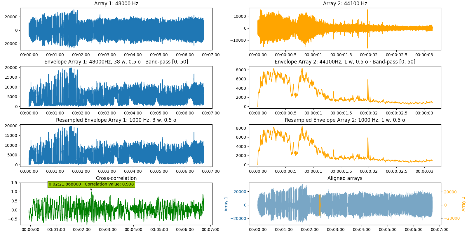
Replying to say that I tweaked @rcomer solution - it seems to work, and I implemented it in a package I developed. This is the result on one of my example outputs: Here is a snippet of the code I used: It is probably very naive code - but it results in exactly what I needed. I just have to call I still think a proper, built-in formatter may be beneficial for other people working on time series - but at least, now, I see that it is possible. Thank you all for your help! |
Problem
I would like to have the x-axis showing the timestamps of the samples of audio files. Here is a minimal example:
Here is the output:

As you can see, the microsecond precision makes so that the ticks on the x axis are shown on top of each other.
Proposed solution
The ideal would be to have the plot automatically decide how many significant digits after the comma are necessary, depending on the level of zoom (in a similar fashion to the way Audacity displays timestamps).
Thank you :)
The text was updated successfully, but these errors were encountered: